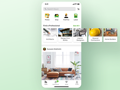
Houzz iOS app - Home page
As a product designer at Houzz, I took part in the homepage redesign. It was an exciting process with many iterations and AB tests.
One of the variants we've tested was a photos carousel vs. the top icons for Photos, Shop, Find Pros, and Latest.
We also tested the position of the Professionals carousel in various placements in the feed.
Another significant test was the entire navigation of the app. The original version had the content entry points in the bottom tab bar (Photos, Shop, Find Pros, and Lates). The goal was to make the user's tool (Notifications, Messages, Ideabooks, and Profile) more prominent. The new version with the illustrated icons as the top won, as it has got more engagement, and it was a more scalable solution for the content.
It was an inspiring process!
Check it out in the iOS and Android stores.
