CheBanca! Redesign homepage
Hello, I redesign CheBanca! Homepage.
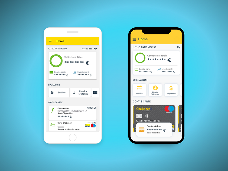
What I improve:
• All the cards now fall within the "Safe Zone" and the user will continue to notice all the information on the homepage without having to give up the contents to be able to access other contents (scroll down). •The cards now refer to a real recall and meaning already present in the user's memory, to facilitate its use and identification. The current account information is now present directly on the physical card, and only the account name and the available balance are highlighted. • The user is now called to focus exclusively on one visual rather than a uniform element. •The operations now refer to the color of the brand, take up less space and take on a more modern style. • The "Show data" information has been deleted to keep the interface only with really necessary information.