Titik Koma Logo
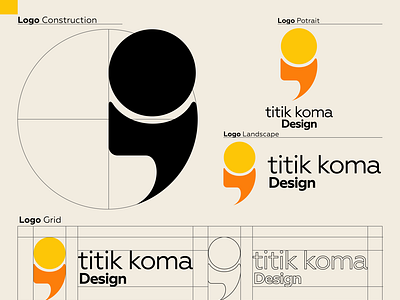
I designed this logo for my business. This logo is a semicolon.
Titik Koma is important punctuation used instead of conjunctions, which means pausing to continue my efforts. In addition it is an appropriate symbol for those who are struggling. the colors are orange and yellow which have the meaning of a burning spirit and never give up.