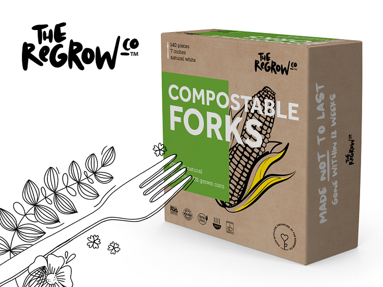
The ReGrow Co. – logotype and packaging
The Regrow Co. is a fledgeling brand aiming at producing environmental-friendly natural packaging and other extraordinary, ecological and biodegradable products.
The client was fully aware that their offering wasn't much different than existing market solutions. An idea sparked, The ReGrow Co. not only needs to be highly distinguishable with its packaging but also with a strong logotype. We've picked a logo made out of font imitating handwritten letters. Such trick allows to underline the natural product's origin.
As a main theme for the final approach we've used the colour of the box the packaging is made. Corn illustration refers to the material used to make their forks. The last bit was to make it look very crafty and handmade - and that was achieved using screen printing.
Few months later, The ReGrow Co. reached out once again, this time to readapt the packaging for knives and spoons - and that can mean one thing - client's business is booming, also thanks to collaboration with Adchitects.
Check the whole project here ——— Thanks, hope you've liked it! Follow us to keep up to date with our upcoming projects. ——— Looking for a world-class digital product? Drop us line at hello@adchitects.co