Ori.Kami Spa & Reflexology.

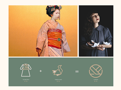
Ori.kami is a reflexology inspired by Japanese culture. The meaning of “Ori” in Japanese is folding, while “Kami” means paper. “Kami” also means us or we in Malay. Hence, the logos we designed are based on the inspiration of the brand. As the target group are for all genders, we made sure the design is neither overly feminine or masculine.
Art Direction & Design: Ideology
Client: Ori.Kami Spa & Reflexology
Location: Alor Setar, Kedah