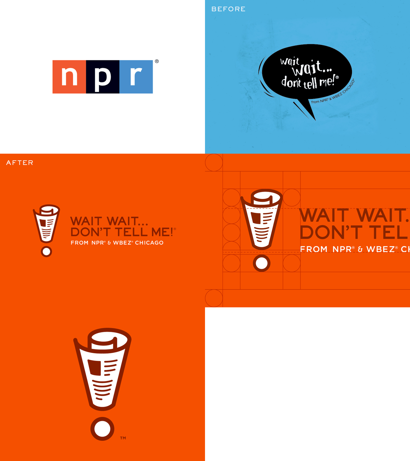
Wait Wait... Don't Tell Me! Rebrand
Finally glad to be able to post the rebrand I worked closely with NPR, Wait Wait... Don't Tell Me!, Katie Burk, and the internal design team at NPR. There are some more print items I didn't include but once I get some samples I'll post more.
Here's some posts about the rebranding:
There were many challenges to overcome on this project: from designing a bold icon that is unique enough that it could be used on its own to organizing the typography of the name of the show with the tagline and making sure it had proper hierarchy.
After the first two rounds of concepting ideas, the team at NPR and myself started figuring out what was working and what wasn’t. For the icon development it was easy to get sucked into making iconic radio icons, but that wasn’t representing the show enough. So,we pulled iconic pieces from the show, such as a service bell. This helped us head in a great direction and set a style as we went for one last round of concepting. I started to think more about the show: how it’s fun, witty, and taking weekly news reports and turning them into a game show. The next step was to sketch in my notebook some rough ideas of newspapers and then combine it with the shape of an exclamation point. This helped combine the idea of news and carrying over the exclamation point from the brand name to create a bold icon that can be used to represent the show.
When laying out the type, I had to figure out the right balance of the type from being centered or left justified. Also, I had to take into account how the tagline will work with the layout of the type. After a lot of work with different typefaces and custom type, I decided simple and clean was the best approach for this brand. I kept the type left justified because when centering the type the ellipsis after “Wait Wait…” would make everything look off balance. I added proper spacing for the type based off the icon because I wanted to make sure that was the main focus of the overall brand.


