Houzz - mobile app navigation redesign
As a part of my role at the Houzz product design team, I redesigned the main navigation of the iOS and Android mobile apps.
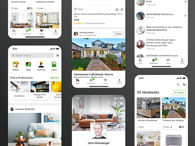
The goal of this project was to differentiate between the user's tools, such as Ideabooks, Notifications, Messages, and Profile, VS the content (Photos, Shop, Professionals, Stories, etc.). We wanted to make the user's tools more prominent and accessible, and we wanted to have a more scalable solution for the content categories that used to be in the bottom tab bar before.
With the new design, we offer our users three levels of browsing; Our users have three levels of browsing; Users that are not looking for something specific and just want to browse the app or to look for inspiration, can scroll down the feed and get inspired by photos, products, professionals and discussions from our community.
Users that know what they want in general but want to explore different options and categories - can browse the main content categories and get inspired in a more focused way (photos, shop, pros, latest).
And users that know exactly what they are looking for can search in the search input by typing their desired item.
We had a super interesting process, and we did many AB tests for both the bottom navigation bar and the top content categories.
We tested three tabs at the bottom bar VS four tabs; We tested a photos carousel for the content categories VS the illustrated icon.
We also tested different copy in some items to find the best terms to increase engagement.
This project changed the entire architecture of the app, and I'm proud I was a part of it. It was an exciting opportunity and process, and I learned a lot from it.
Check it out in the stores!
