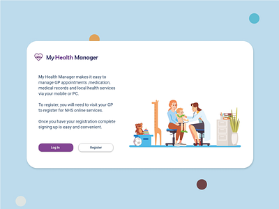
Primary Healthcare Management desktop
This was developed as a UX challenge for a Msc UX design. I asked a number of users what they needed from a healthcare app- That was booking appointments, ordering prescriptions and viewing records. They wanted a stripped down version of a healthcare management app to just access what they needed.
From the survey I deduced that the app needed to convey:
Trust
Competence
Security
Calm
The colour scheme was chosen to evoke trust and confidence.I am trying to stick with simple illustrations as to not overload the patient. I've leaned away from medical imagery to impart a calm feeling when the patient may be stressed.
This is the login/registration screen for the desktop version
More by Maeve Breslin View profile
Like
