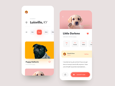
Pet App Design
The team is available for new projects! Drop us a line: hello@purrweb.com | WhatsApp | Website
What’s up, mates? We hope you stay safe and do not forget to feed your Buddies. Glad to show you our new design for a pet app! What do you think about the colors? Bet the design will be also great with a dark-mode on. It’s an app created for you to take the best care of your pets. 🐈 On the shot: the first screen is the main page where the user can see their pets, near-term plans, and some news on the pets’ world. The screen in the middle presents the so-called ‘pet’s page’ where the user can find all details about its’ health conditions. The third screen shows where your pet is walking 🐶 (or sleeping 🐱) right now. 🐩 The colors: we decided to choose a bright and colorful palette because we believe our pets = our pride and joy, and it came up in the design.
🙅🏻 What is the thing? If you lose your pet — don’t let the panic strike you. Pick up your smartphone and go see where it is.
Created by Julia Vakulenko
Feedback helps us improve and grow, We’re keen to hear your thoughts!
We share experience in designing interfaces for healthcare startups 🏥, give insights into developing an app for pet owners 🐈, and reveal the secrets of coming up with a competitor to famous services 🤩
Keep in touch and check out our recent news 💜


