UI Guide
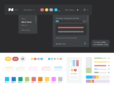
I have put together a small UI guide based on the Nutanix interface i've been doing.
Since we are in the middle of a big release, all the engineers are super busy correcting bugs and implements last minute funcionalities. I took the opportunity to have a little bit of free time on my hand to design this UI guide. Entirelly based on the design this guide is very usefull for multiple reasons:
- it will allow me to keep a very strong color and style consistency all through the UI. Making sure I'm using consistently the right blue, reds, border color and text color etc...
- it will allow the developers to keep consistency in their code (exactly like in the design, we can now use variables for colors, text, borders etc, making a very flexible and strong code).
- it will allow the developers to code custom components and be able to use at will the UI components in popups or ui elements that don't have a design
- it will allow me to come up with new design elements / pages without designing them. For those last minute implementations. When you don't really have the time to design the page but need to accuratelly explain the elements to the developers.
All in all, even if it seems like a tedious and long exercise, there is only good values and positive effects to pass trough such an exercise.

