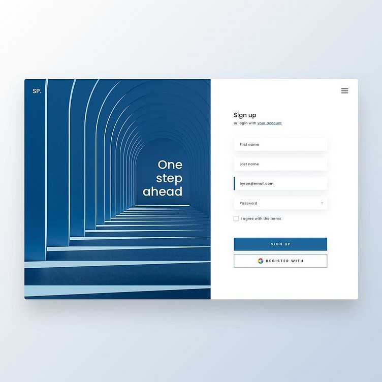
Sign up landingpage design
📥Sign up landingpage design . When it comes to registration pages simple is better. Focus your page design and content to only include the most important points. It can still be colorful and fun, just make sure it gets straight to the point. The less distractions the better! . Keeping things short and sweet helps focus the viewer's attention. The only action they can take on this page is to submit the form. From the moment you load the page it's clear what you have to do and how you will benefit from doing it
Image: Freepik .
More by Khalid Almallahi View profile
Like
