◇ Cat & Dog
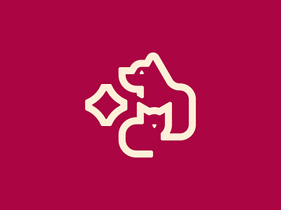
Wanted to make this logo in the one-line style but felt that the composition was unbalanced so added the diamond and it looks much better. The silhouette in the negative-space was improved further with the use of some little triangles.
It spent a long time in phases of not-sure-what-colors-to-use and random-color-generator-abuse yet ultimately it has what you see from another old and unfinished design - to put it in perspective, it is from about this time last year.
Hope you enjoy.
