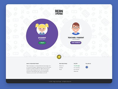
Regn med Penge branding & web design
Regn med Penge (wordplay in Danish – it means "count with money" but also "rain with money") is a friendly browser app that teaches kids how to count with money in a fun and easy way. It’s very simple to use and easy to implement into the school classes as well as parental teaching.
I got asked for help with making the brand new identity (see more here: https://dribbble.com/shots/12199219-Regn-med-Penge-branding) and a website which would show their values and product. It also had to appear to their target group – parents and math teachers, as well as kids who can play the game through the website.
The new branding is full of curved edges, “moved” outlines and vibrant, happy colors which make Regn med Penge branding friendly, fun, and exciting.
The elements on the website keep up with the visual identity, eg. buttons, background boxes, and images with icons. The look and feel is clean and fresh, showing the professional side of the brand, as well as friendly and playful with the use of colors, buttons and graphic elements.
Say hi! 👉 marta.okulicz@gmail.com

