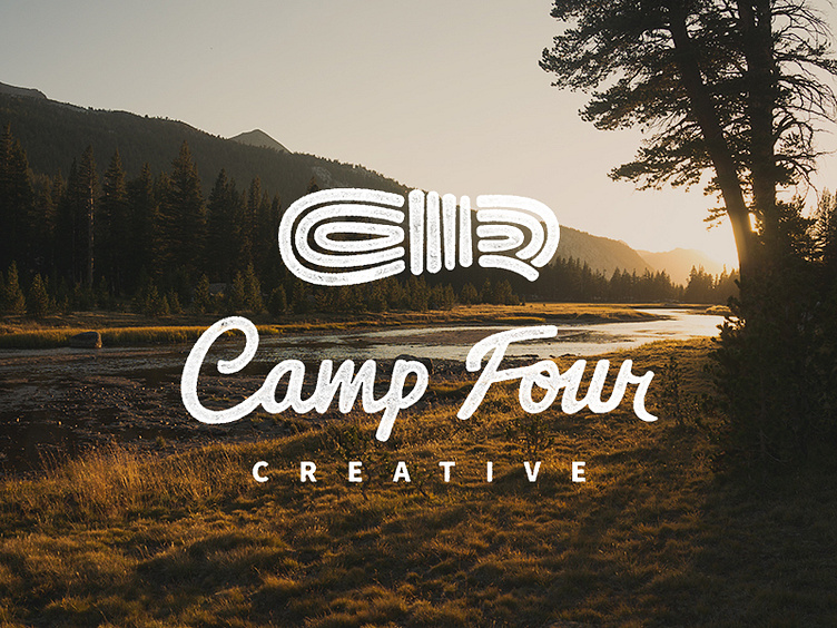
Camp Four Creative Logo - Round II
Round two of our new logo – this time trying for a more rustic "stamped" feel. I also updated the connection between the o / u and dropped the right side of the r a bit. Thoughts, suggestions?
More by Alyssa Hitchcock View profile
Like

