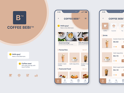
Coffee BEBI
A small project in the rainy afternoon.
I really want a hot cup of coffee and watch the rain fall outside the window.
A BEBI brand with a feminine pink tone and the mischievousness of an active and youthful girl. I chose the minimalist for BEBI. The simple yet gentle focus on what users want to target when opening an app about drinking.
Promotions, favorite drinks and snacks that are appreciated by customers.
When I learned about competitors' apps, I found that most of them put their newsletters right on the app's home page and that the news was largely unrelated to the issues their customers needed. I still don't understand it now because they did it again and what does that mean?
If you have the answer, please give me the answer.
Thanks for watching! :)
