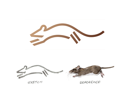
Mouse Logo Evolution
Here is a comparison from the reference image to the final logo for the mouse logo I created.
Here you can see how I worked to simplify the lines, creating a more elegant flowing shape.
Let me know if you like this style of post!
More by Robert Nowland View profile
Like

