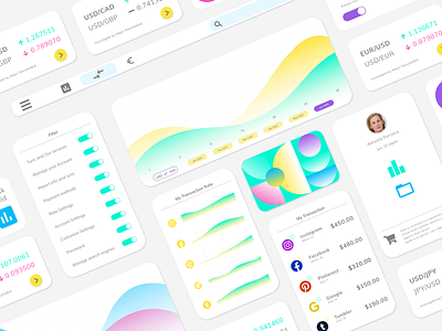
Daily UI :: 066 / Statistics
🏀 Statistic 🏀
I have been seen so many statistics web site while lots of time. Mostly the site has a complicated design and used a dark background. I looked back for this time those things and, in my perspective, I think it should be more use clear design. Because the main contents will be a lot of numbers. To avoid becoming a mystery-solving site 😅
I hope you take a look at it! Give my expression an "L" on you. Follow me if you don't want to miss upcoming my work. I have one invitation for a cooler designer. Enjoy it 😋
More by Yuya Hashirizaki View profile
Like
