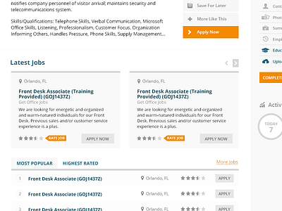
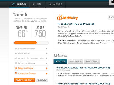
Applicant Dashboard - left v2
Here's another take on my dashboard layout. I think that I prefer this style, whereas the other one is more of a nod from the original design. I'm trying to tie it into what they have currently until we completely rebrand and redesign the whole thing. This one might be a good bridge for that gap, though I'm not sure what the rebrand is going to look like.
More by Rakel View profile
Like

