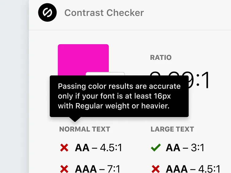
Tooltips for Contrast Checker
Here’s a sneak peek at a WIP of tooltips! A little update coming to Stark.
Tooltips are there to educate you around not just the color contrast (which Stark checks) but the other properties you need to double check regarding your type—ensuring passing rather failing happens, obviously.
In other words, if your font-size is 8px yellow text on black background, it definitely will pass the color contrast (in fact, it’s one of the best pairings you can use!). But given “Normal” text is considered 16px font-size with Regular weight, it will not meet accessibility standards.
We know deep type analysis is something you all have been asking for. Hang tight! We’re working on it ;) In the meantime, here’s a little tooltip with some reminders for you.
More by Stark View profile
Like
