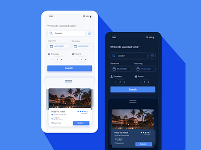
Minimalistic Travel App UI
One hour Design Challange for travel UI. Following a minimalism approach, using only whites, and an accent of blue. A dark mode added because who doesn't love a good dark mode that shields your eyes from pure white? Based off the user experience from expedia
More by Pixbyte Design View profile
Like
