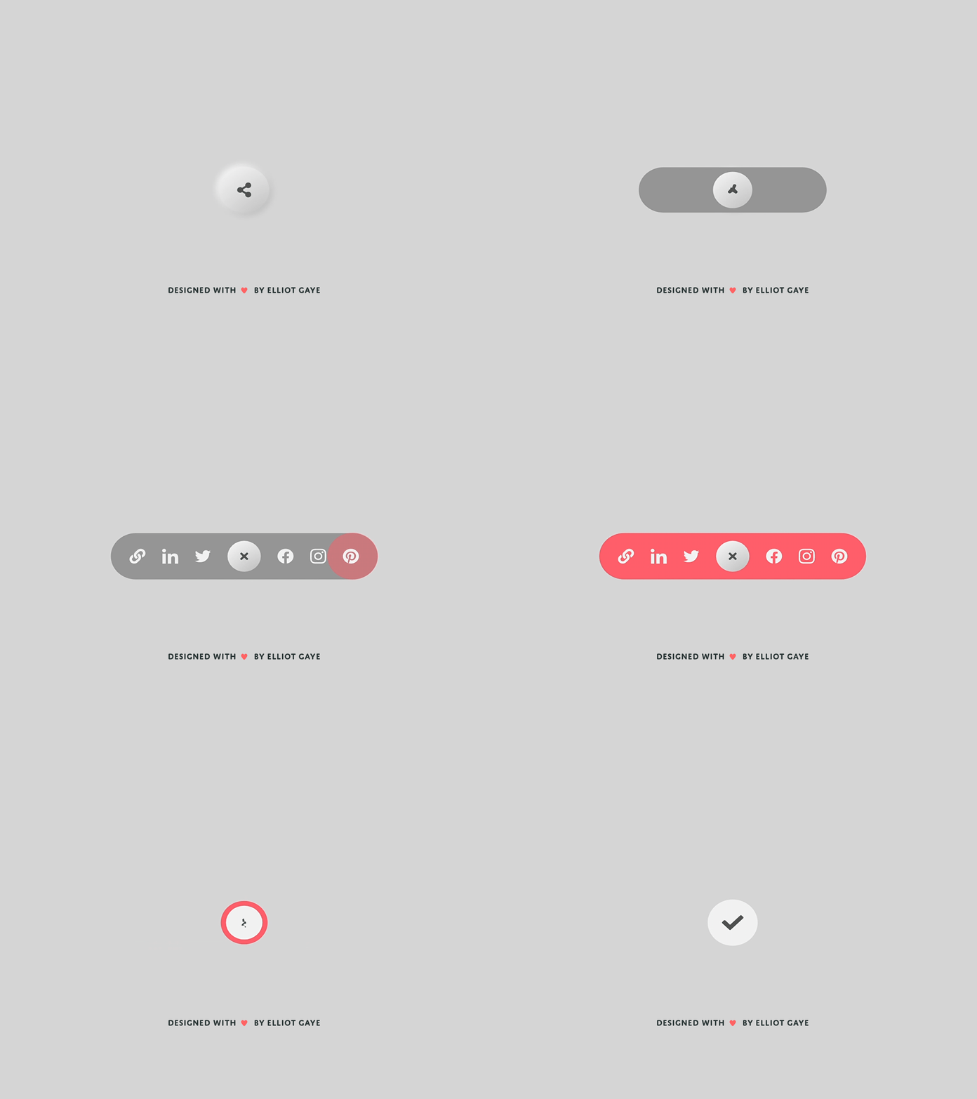
DailyUI #010 - Social Share
Moi Dribbblers 👋
This is my #010 #DailyUI design.
Design Hint 💻 - Design a social share button/icon and be mindful of the size, imagery, placement, and purpose for sharing.
The Idea 💡 - The idea for today’s UI design is a social media share button for a theoretical app for Android and iOS. I don't really have any idea going into this of what the design will look like; this task is a "shot in the dark" or "experiment", and there's only so much you can do with this type of feature. So, with that being said, hopefully I will churn out something that looks aesthetically pleasing but also unique.
Final Thoughts 🧠 - As I've previously noted, I didn't have a clue what my design would look like at the start, I experimented with a few ideas and eventually came up with the one that is being showcased here. I am more than pleased to have achieved this piece - its exceeded my expectations due to the previously mentioned reason of; there's only so much you can do with this type of feature. The simplicity, neumorphic elements and splash of colour, together, make it look modern and refined. The .GIF creation was also the best I've done to date for one of these #DailyUIs. The animation in XD is super duper quick, but recorded at 60fps was enough to make it somewhat quick enough for the gif to look alright and also keep its proper animation in place - if it were a video instead of a gif, it would look and perform a lot smoother and refined, just take my word for it haha. Overall, it's been a chill day of experimenting and improving my gif creation skills, and I love my final design.
Hope you like, press "L" if you ❤️ my work!
As always, I welcome any feedback! 😄
Lastly, share the love by pressing the share button if you really like what you see! 👍
- Elliot
