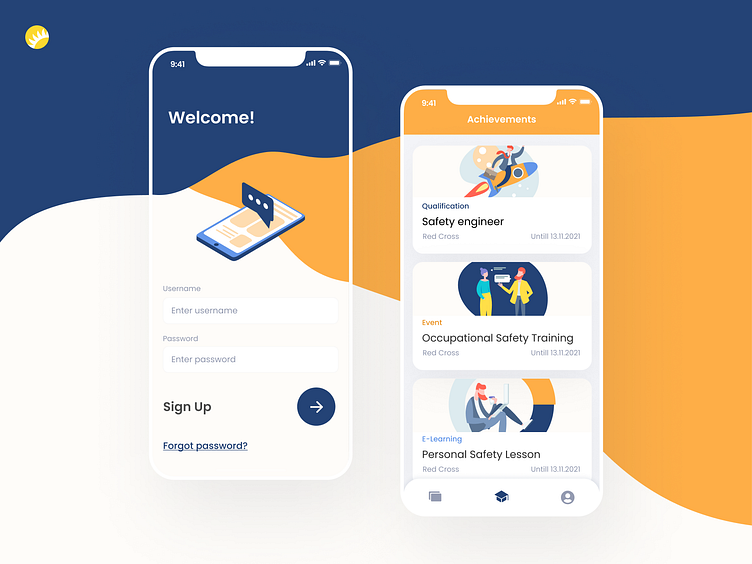
Online training platform design
A large consulting company specializing in labor protection and industrial safety approached our software experts to build an online training platform. The platform consists of a web client (for trainers) and a mobile application (for trainees).
The customer wanted a simple, “clean”, and user-friendly interface with a pleasant and bright, but unobtrusive color scheme. These were our key guidelines when creating the design. We created an interface with quick and simple navigation; as for the visual part, we used dark-blue and orange shades as the main colors, and white as a background. --- Press "L" if you like it :)
Want to see more projects? Visit our Team and remember Andersen ;)
More by Andersen Design View profile
Like
