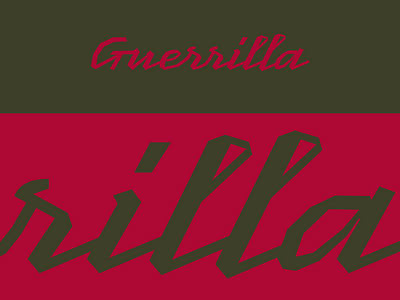
Guerrilla Lettering Reject
Here's a recent piece of lettering (rejected) for a sports brand project.
The challenge was to design it only from straight lines (making it look rather masculine but with lettering flair). Ultimately, it didn't occupy the space where it was intended to be very well so we decided to go another direction.
More by Rodrigo Saiani View profile
Like
