Type Beer | Packaging
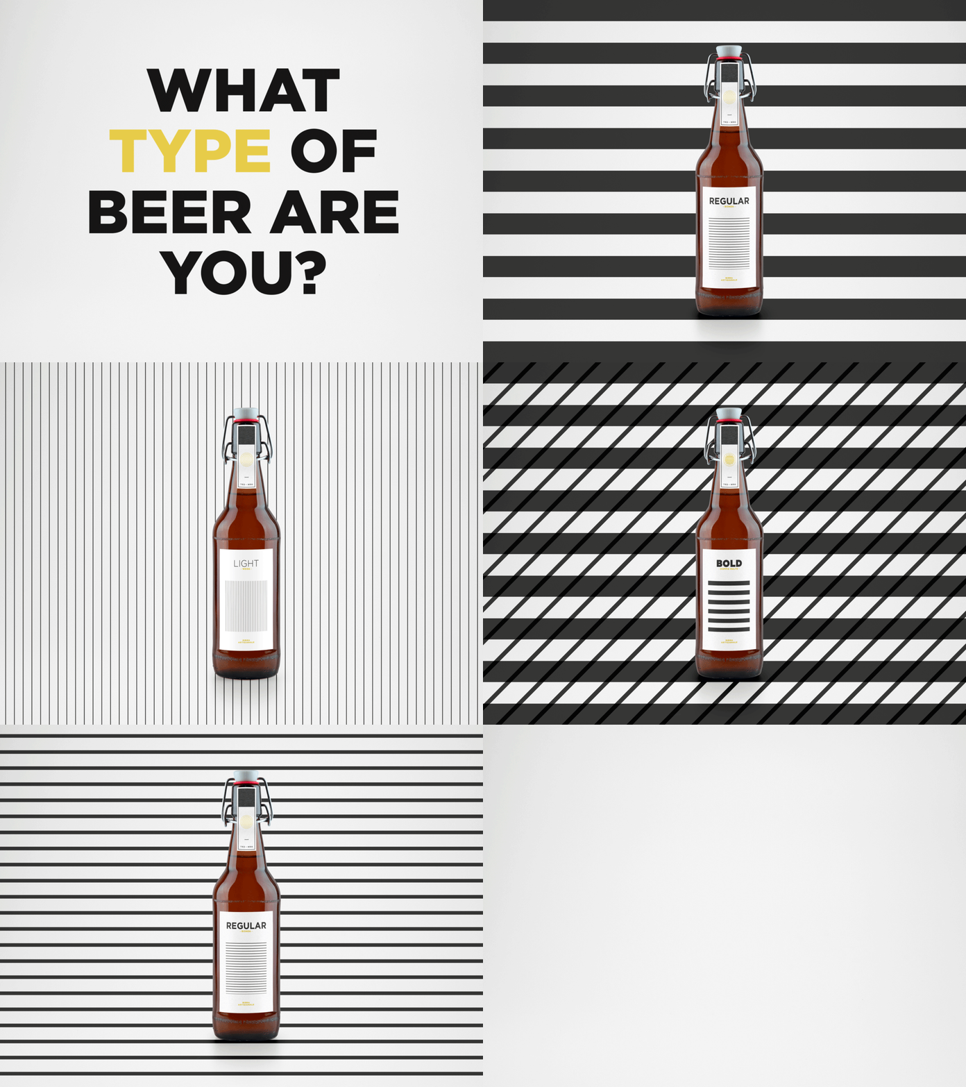
In this project we approached the world of beer labels trying to decontextualize them, to create graphics with a bizarre and unusual character.
We decided to use as a guideline the font, playing in particular on the different typefaces versions. So the four types of beer correspond to the four main font style: bold, regular, light and italic, which graphic characteristics describe likewise the different tastes of the beers (the “bold” is a double malt, the “light” is a weiss, etc...).
_FULL PROJECT
https://meta-arts.it/type-beer_graphic-packaging-design/
More by duh_studio View profile
Like
