Google Rebrand
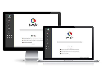


I feel the old Google logo is starting to get outdated with their current style being minimalistic and flat so i decided to make the logo more modern but at the same time keep the features that makes the logo extremely recognisable for example the colours and the fancy 'g'
The rest of the layout has been designed to work with computers, tablets and mobile devices.