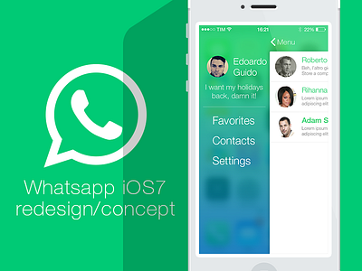
Whatsapp redesign for iOS7
This is the work that shaped my idea of iOS 7 app and can be summarized in a few points:
- Transparency that reminds opaque coloured plastic (achieved with less opacity and more blur under the layer e.g. navbar and side menu background)
- Slim fonts with solid colour (no patterns or gradients)
- No gradients for UI elements except for backgrounds (e.g. navbar and side menu once again)
- Flat, but not too much: I really like the use of flat layers in order to make things like they were real objects (e.g. the phone in this image is flat styled, but the shadow that covers the logo and the title make the viewer perceive like the phone had a depth)
______________________________________________________
If you want to check out this concept on Behance:
http://bit.ly/1dvMScI
If you want to try this concept:
https://popapp.in/w#!/projects/5217c866b1eaa78b02000805/preview
If you want to try other concepts of mine:
https://popapp.in/w#!/users/51d4beee3b69bc36440016e9/projects
If you want to check out my other projects on Behance:
http://www.behance.net/EdoardoGuido
I really hope you will like it!
