Dixon


A favourite brand project of mine, a oldie but a goodie.
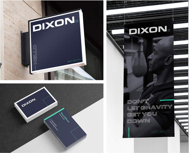
This was a brand direction we proposed for a Sydney based personal trainer.
This word mark is based on Lifestyle brands, with a sporty twist. We use the outlined square dot at the end of the word as a form language for the brand, representing discipline and perseverance.
Designed at True Syd.
A favourite brand project of mine, a oldie but a goodie.
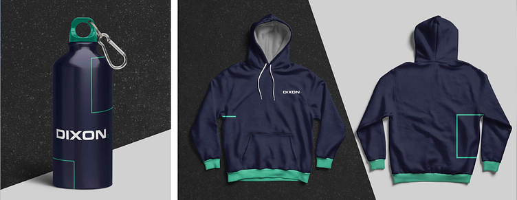
This was a brand direction we proposed for a Sydney based personal trainer.
This word mark is based on Lifestyle brands, with a sporty twist. We use the outlined square dot at the end of the word as a form language for the brand, representing discipline and perseverance.
Designed at True Syd.
A favourite brand project of mine, a oldie but a goodie.
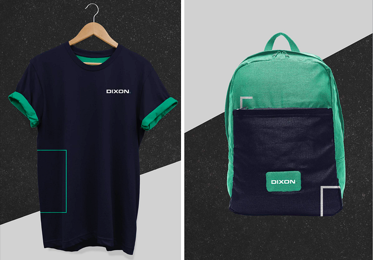
This was a brand direction we proposed for a Sydney based personal trainer.
This word mark is based on Lifestyle brands, with a sporty twist. We use the outlined square dot at the end of the word as a form language for the brand, representing discipline and perseverance.
Designed at True Syd.
