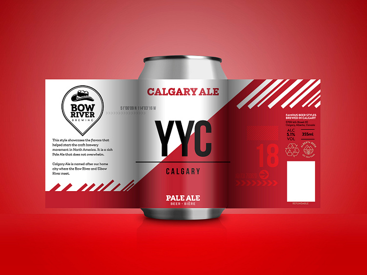
Craft beer label design - Pale Ale
The client wanted to pay a homage to the city in which they live and thought that there was no other better way to do this than to craft a special brew in its honour. Thus, the Calgary Ale was born!
Since this is about highlighting Calgary, it made perfect sense to use some of the distinctive elements that identify the city. The official city colours are red and white so these were the base for the design. The bold and striking red makes a stark contrast against the pure white giving a dynamic and vibrant feel.
The YYC nomenclature stands for the official International Air Transport Association code and Calgarians have adopted it as well in their everyday life when referring to the city.
By adding some graphical elements that can be found throughout the airport, travel tags and GPS coordinates, we start to build a feeling of a destination. All together, we get the sensation that this beer will take us on a refreshing journey.
