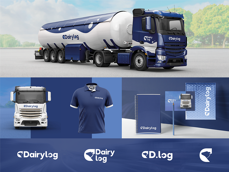
DairyLog | Brand Identity
ABOUT THE PROJECT
DairyLog, a company that operates in the segment of liquid food cargo (milk) with nationwide coverage.
🔘 The main challenge was to unite 02 primary meanings that provide the basis for the company:
01 - Symbolize the branch of activity - milk transport; 02 - Make it explicit that it is a transport / logistics company;
🔘 To reflect this proposal, there was the construction of a cow silhouette in negative space, symbolizing and referring to milk;
🔘 As for the logistics segment, there was also the use of negative space, but this time taking advantage of the very "core" of the letter O of the word LOG that represents Logistics, where the simple space was replaced by the icon of an arrow symbolizing the segment in question.
I'm available for branding projects :)
