Native Roots — Unused Direction Pt. 2
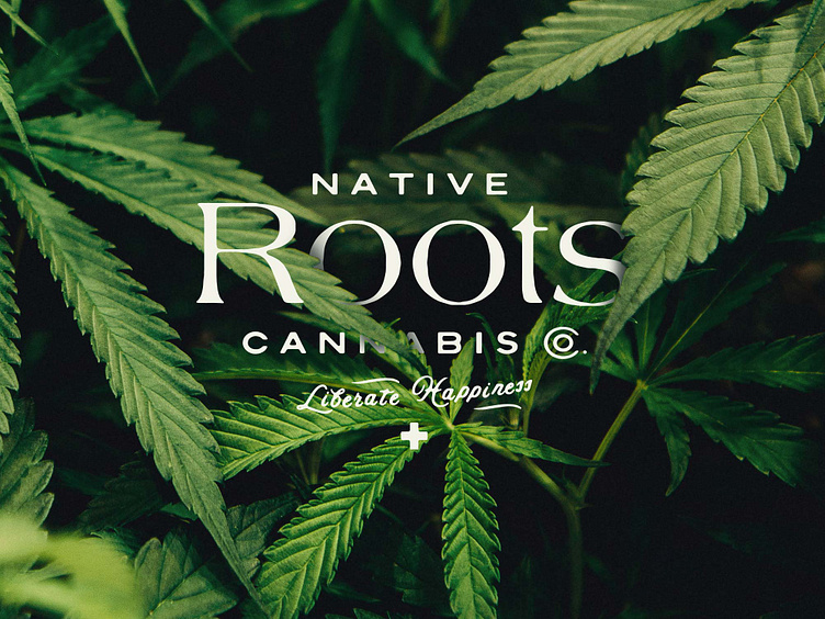
A different, unused iteration of the Native Roots heritage/apothecary brand approach. Always fun to look back at early, R1 concepts and see how little moments of them ultimately informed the final design (as with the "Liberate Happiness +" and type style of "Native" and Cannabis") . Full case study can be found here : https://www.vicarelstudios.com/native-roots-marijuana-dispensary

