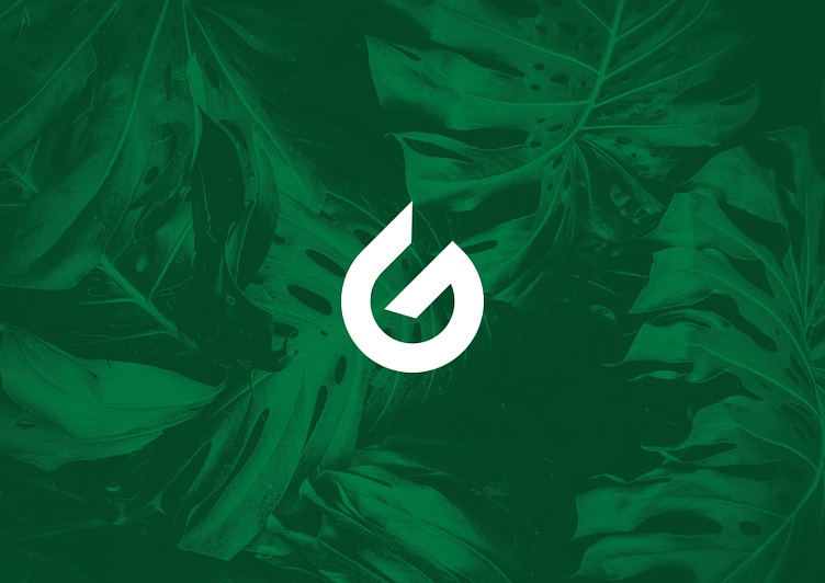
Green Fest Logo
Green Fest already with an updated identity! Today, ten years after the Green Festival was founded, we are unveiling a new identity for this traditional event. From now on, you will encounter the new look everywhere in public spaces, on our website, social media, as well as in our products and services. We believe that the new look of Green Fest is related to the cause of our festival, to our pre-determined culture and values. Green, as you know, was the identifying color of the miners' city many years ago, which has been used in the identity of the city and the various subjects of Mitrovica over the years. The city of Mitrovica is also surrounded by the mountains of Shala e Bajgores, which in our logo are transmitted with mineral’s color, mountain color and with the symbolism of the leaf. In addition, the city of Mitrovica has four rivers and is positioned near Ujman/Gazivoda lake, which characterizes the presence of abundant water, and within the logo we have integrated a symbolism of the water drop. Both of these symbolisms are intertwined within the letter G, as further identity of the Green Festival in Mitrovica. These values and the increased care of the citizens, undoubtedly make Mitrovica a green city. We strive to stay loyal to our values as well to the users we serve
