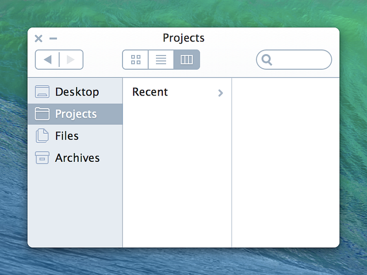
Finder Neue Graphite
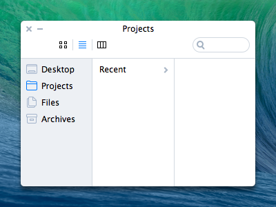
Check out the @2x because the scaled-down version looks like crap.
The selected item in the sidebar easier to see. The segmented control for view type is now more obvious in how it works and it's state. The header now has a slight gradient to help differentiate it hierarchically from the file browser.
More by Matt Zanchelli View profile
Like

