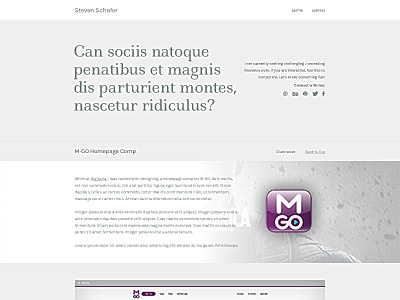
New Portfolio Design - WIP

Here's a rebound of the original thanks to Abe's feedback
Thanks for the feedback man. I aligned the type on the right side to the top of the quote in the "feature area"
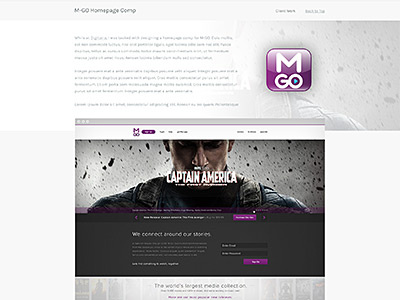
I tried fading the project descriptions out with a gradient, but it killed the whole "flat" look im going for. I'm trying to avoid gradients where I can.
Instead, I pushed the project stage / browser up into the description block a bit. I think it ties them together a bit more..
Very valuable feedback. Thanks a lot.
-Steven