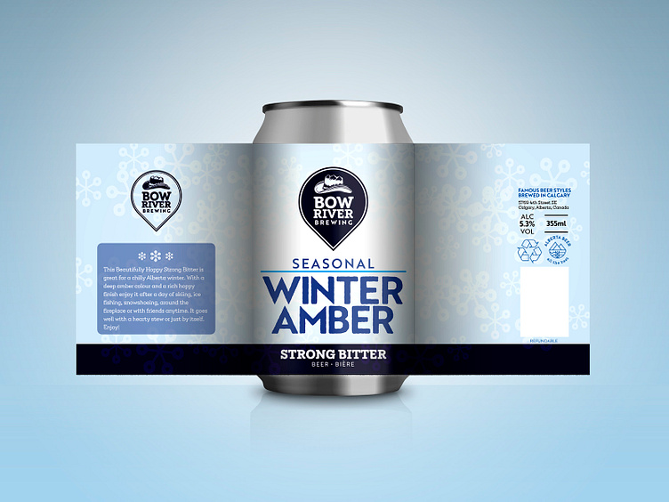
Craft beer label design - Strong Bitter
The label of this beer was designed to highlight the fact that this is a seasonal brew. It relies mostly on a typographical solution rather than heavy use of illustration elements when compared to the main line of beers.
Since these seasonal brews are in a way experimental, the idea was to keep a fairly simple design that could be quickly updated by just changing the name and description of the beer. Each season would have a unique background which would also help to differentiate them.
If a brew becomes well accepted by the public and is popular enough, a design with a strong concept behind it is developed helping to focus the customer's attention on the beer, rather than the brewery. In the meantime, within the design, the brewery gets more attention by having the logo sitting front and center of the can.
For more visual references, have a look at the other beer label designs.
