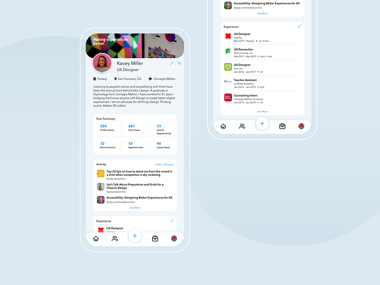
Daily UI. 006 - User Profile
For this #DailyUI #006 challenge, I decided to go for a redesign of Linkedin's profile page as it's basically 1 of 3 apps I use the most on my phone.
I went for a more minimal, rounded look to contrast Linkedin's current "square-ish" design. I also feel like the user profile is tucked away in their current app (a bit hard to find). So I gave it more emphasis by placing it at the main nav bar and cleaning that up a bit. Who agrees? :-p
More by Juliana Gregori View profile
Like
