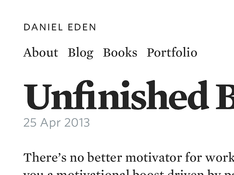
Menlo
Taking advantage of Mercury’s outstanding bold weight for a big ol’ redesign of my site. This’ll be the first time I’m archiving the old design, too!
I call this design “Menlo”, and with any luck, it’ll be finished soon.
Update:it’s live! I’m impatient. A couple of fun facts:
- I used Sass. And I liked it. Turns out I was wrong about preprocessors. Also, the generated unminified CSS is actually about 200 lines less code than the last design. - I also used Jekyll. I’ve been wanting to move away from database-driven sites for a while now, and finally got round to it. - Finally, I picked Mercury because I didn’t really like it, but couldn’t figure why. I think it wasn’t as expressive as I would liked it to have been, but that was before I’d seen its bold weight. Isn’t it beautiful?
