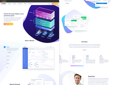
Method Spend
Here's a Spend page that we designed for Method (formerly Denteva) — one of America's largest dental procurement companies.
See it live: https://methodusa.com
We went heavy on the asymmetrical shapes, gradients and micro-interactions with the main aim: to impress potential partners and stand out from the competition.
• • •
We are taking on new projects — from visual identities and brand strategies to websites, mobile apps, illustrations, and animations. Email us at hi@overspace.co✌️
More by Ōverspace View profile
Like
