Travel App Design - Explore
Hi Dribbblers!
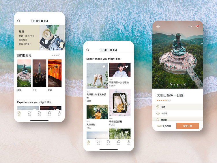
Here's a glance at the tour exploration screens of a travel app I designed for a client.
- A travel-related daily quote is shown on the home screen to set the tone of the app. - Users can add tours to wish-lists by simply toggling the heart icons on the tour cards. - The "view date" call-to-action button sticks at the bottom of the tour details screen to encourage a higher conversion rate.
More by Melissa (Jo Chun) Hsiung View profile
Like

