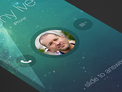
iOS7 - Contact
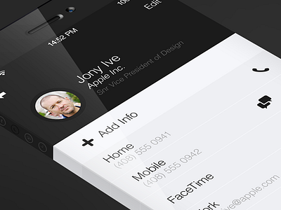
next up is the contact screen
for this screen i wanted to emphasise the contact name, picture and job more than the current iOS7 design. For me it's important to see who the contact and there basic details before all the contact information.
I have spaced out the info from each area on screen as the current iOS7 design has no clear areas defined which can make viewing the info difficult especially with large amounts of data.
i've also added my icons from the iOS7 set and made them a little smaller to fit within this screen. These icons are not only visual indicators but act as buttons, the map icon would launch the maps app with the address highlighted.
as normal the real pixels are attached with some annotations as to what each element is on screen :)
thanks all for the awesome feedback on all these shots.

