Daily UI 023 — Onboarding
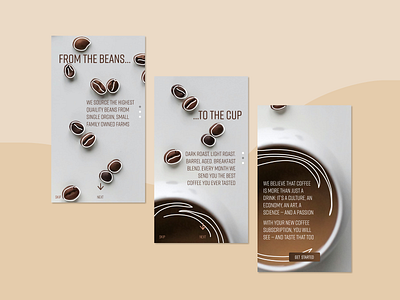
The idea of this onboarding page is to get you excited about your monthly coffee bean subscription. The user swipes up to get from one screen to the next, which flows down from one single image. The white outlines are just to add a little fun element to the screen.
More by Hattie Chau View profile
Like
