CAP Dashboard Mobile App
These frames were designed to make accessing one's work schedule more user-friendly, as well as improving increased comprehension of information.
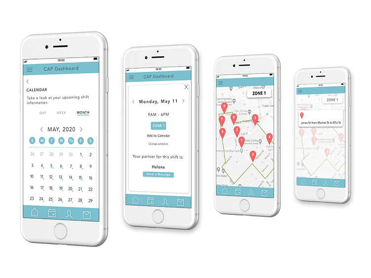
The flow goes as follows: - Opening up one's calendar in the CAP app - Viewing it in the Month, Week, or Day view - Blue circles next to date indicates a scheduled shift - Click on a day for full information on schedule - Ability to see partner for shift and reach out to them to coordinate - Ability to click on the Zone scheduled for that day - Ability to click on Zone Hot Spots and gain a better understanding of responsibilities for upcoming shift