iNKMYDAY! Logo
Logo for my Design Bureau, mainly focusing on new media and visual identities. It's closed right now, because I joined forces with another awesome Studio, but I like working on its identity nonetheless.
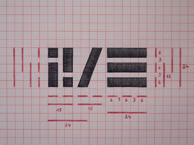
First part of the Logo is the shortest possible acronym for the Name, taking the first an the last letter, second part on the right is the [nowadays] common icon for a menu in Apps/Applications and on mobile Websites. Both parts are connected with a simple dash in order to contrast the strict rectangular and symmetrical shapes of the other components. Overall it's strictly geometric, based around the number three and its multiples [as you can see on the red construction lines and numbers], aiming for a bold, simplistic appearance.
Additionally: As so often, an interactive version of the Logo is going to serve as the Menu-Toggle-Button in the Header on small versions of the website, giving the Logo a more functional design.
I'm quite happy overall, but still not shure, if it needs a frame. going to add a 3pt Frame in 3 or 6pt distance for the next shot.
And by the way: Hej there, everyone, glad to join the game. Thanks @NIMIUS for bringing me in! :-)
