Fluree- Website Design & Re-Branding


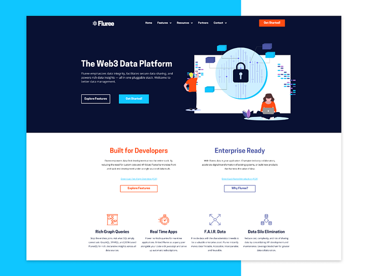


Sharing some of my favorite elements of the Fluree website redesign I completed at the end of 2019. The new site was rebuilt and redesigned from the ground up to provide more brand cohesion and to more clearly walk users through the product's value prop.
In addition to redesigning the website, I also created this brand palette and new logo which are featured throughout the website. We wanted the new branding to feel inviting without coming across as overly playful. The logo features a "snowflake" shape and that snowy/icy branding is continued throughout the color palette and naming conventions within the product.
Learn more about the branding update here: https://flur.ee/2020/02/04/meet-the-new-fluree/
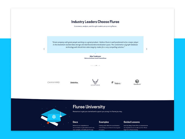
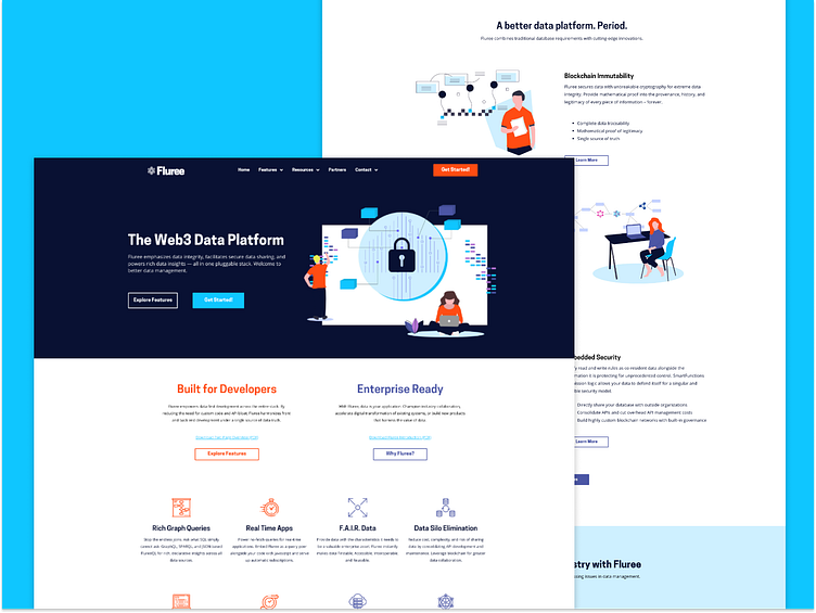
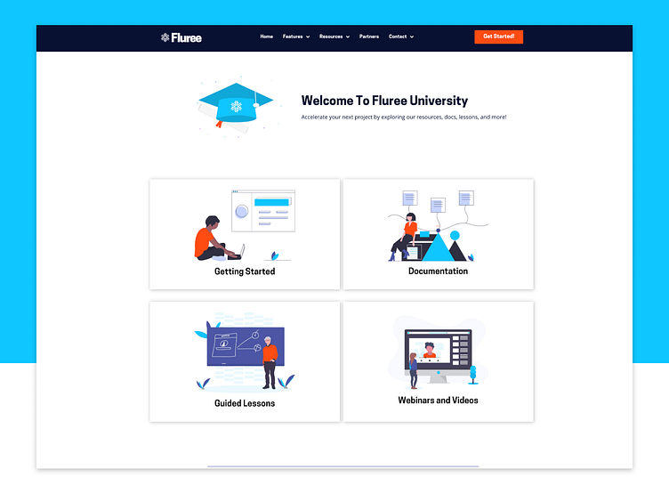
