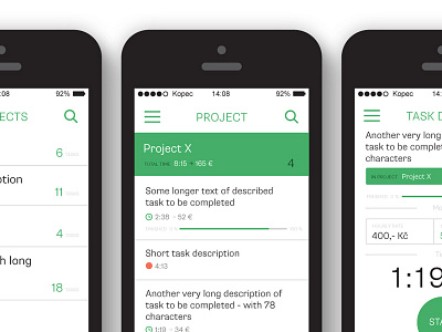
Tiiky revisions
After some weeks I opened Tiiky app drafts again and made some changes in design. I reduced the number of colors, changed the icons on bottom to look more like buttons to tap and a little bit simplified the tracking screen. I think it is better now and the design is more consistent.
More by Tomas Kopecny View profile
Like

