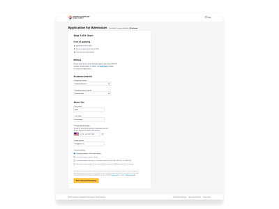
Application for Admission - Step 1
Application for Admission flow
Users don’t like forms, no matter how ‘pretty’ and ‘delightful’ we make them. A web form is always in the way, it’s an obstruction…The ultimate goal is to make it intuitive, logical and as straightforward as possible.
We don’t need people to love our form, we just need them to complete it.
And of course it’s easier said than done…
Few things I’ve done for this application form:
1. Remove exit options - top navigation taken out, only ‘brand/logo’ left and ‘Help’ left. We don’t want to distract users from the main task here- filling out the form...
2. We provide approx. time for completion. It’s hard to predict but we should give then an idea of how long it could take.
3. Clear indication for current step and how many steps are left to completion.
4. Ideally we would include a list of information/documents required to fill out the form, but this flow has so many different scenarios that simple list of all possible documents would be too overwhelming in this case. Not to mention confusion casued if we list documents that don't mean anything to some of users (e.g. military related credentials).
We left this part for later iterations.
5. We start the conversation with what’s valuable for the user: their interest, and after that we move to asking for personal information.
Imagine being stopped by a stranger on the street and asked about your name and phone number without a good reason... Now imagine that stranger mentions something you are interested in and after that he moves to asking personal information- which one feels less awkward?
6. Indicate required/optional fields. One indication on top e.g. “all fields are required” will be missed by some users. Asterisk for required fields kept in red(well established convention) and before label for easier scalability ( at least with the alignment we used).
7. Input fields do not have to align nicely in width. Width of field should imply input expected- e.g. Zip code field width should be equal to phone number.
8. If you’re asking for sensitive information(phone number, SSN, DoB) always explain why you need it.
9. Button labels should give an idea of what to expect after clicking it. In most cases we can do better than ’Next’ or ‘Continue’
More soon…
----------------------------------------------------------
Feedback, especially negative, always welcome!
