Responsive design perspective - Justinmind

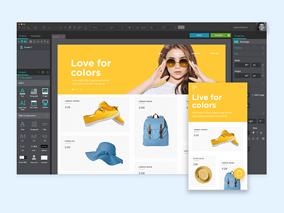
Here's a perspective of designing a responsive website in Justinmind. Designing mobile-first and scaling up is the way to go!
⚡️Our tool lets you design for different screens in the same prototype.
Why not download Justinmind for free and try the create a basic responsive prototype excercise?