Curen Logo Design
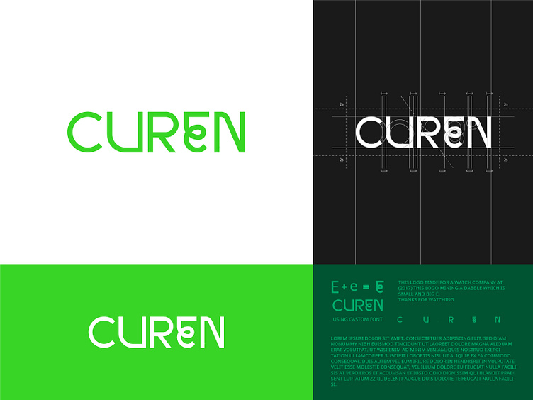
Curen logo design- This logo made for a watch company at (2019). This logo detels : This logo has been created using its own font. The e section in it is called double e. Since it is made for a watch company, It has some features. The first of which refers to the c watch in its support. And the rotating eating indicates the passing of time. My email adders: 123mosaibulalam.sifat@gmail.com My website link: mosaibul My other portfolio:
> dribbble > behance connect me in -
">fiverr Thanks for watching!
