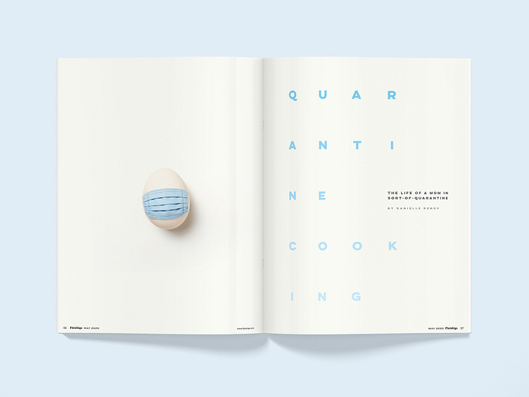
Quarantine opening spread. Fleishigs Issue 17. Danielle Renov
The Magazine design tends to be a little "loud". This spread was almost jarring in its white space. really put the brakes on and made you stop and think!
More by Naftoli Mann View profile
Like
