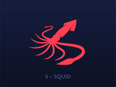
Squid Logo Concept
(S)quid Logo Concept!
With this design I set out to convey a very distinct sense of perspective, so it feel as though the tentacles were reaching out to you and away from you, drawing you into the design with a sense of hierarchy and depth. I love the curvature of the tentacles, I put most of my time into their shape, giving them just the right combination of feeling alive, yet loose and waving in the current. The red and navy was an obvious choice to convey the depth and provide a pleasing contrast.
Squid are such fascinating and intelligent creatures I knew I had to turn one into a logo as part of the logozoo challenge. When I was a kid I remember going to the Melbourne museum on a school trip when they'd just gotten one of the worlds first complete giant squid specimens in where it was preserved. I felt as though I was in the presence of an alien, and ever since then I've had an appreciation for their curious allure.
I'd love to hear your thoughts on this design in the comments below! I'd give it a sea plus.
