Eye Clear
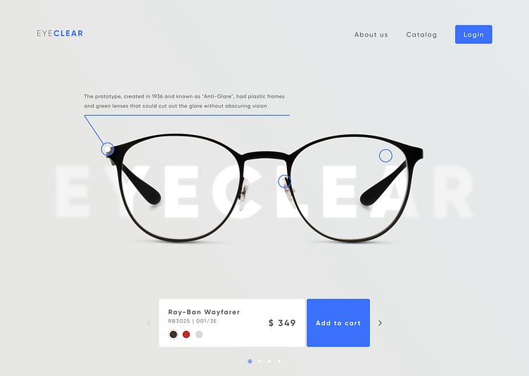
Hello everyone! Today I’ve prepared the next portion of visual enjoyment! Website for a glasses brand. On the main screen, the emphasis is placed directly on the new collection. On the product itself, you can read the description of each element: what material is used, information about lenses and additional elements. Pagination of the collection is placed at the bottom of the page, but you can also go to the catalogue from the header. Also, there is a personal account for regular customers
More by Oleksii Voronin View profile
Like
